NBA Sports

Ranking All 30 NBA “City Edition” Jerseys, From Boring To Bomb AF

Ranking All 30 NBA “City Edition” Jerseys, From Boring To Bomb AF January 5, 2018

In their first year as the NBA's apparel provider, Nike has unveiled a new set of uniforms that are supposed to speak to each team's fanbase: the "City Edition" jerseys. "The Nike NBA City Edition uniforms represent insights and emotion from the court to the upper deck to the cities' streets, in pursuit of a unique way to capture each team and its city in a way that respects the past and present of the clubs while also positioning them for the future," Nike said in a press release. Some of them are so fire you can't see them through the smoke, while others might make you want to put flame to them yourself. Here's our ranking of all 30 Nike NBA City Edition jerseys.

30. Houston Rockets

IMAGE BY: Nike.com
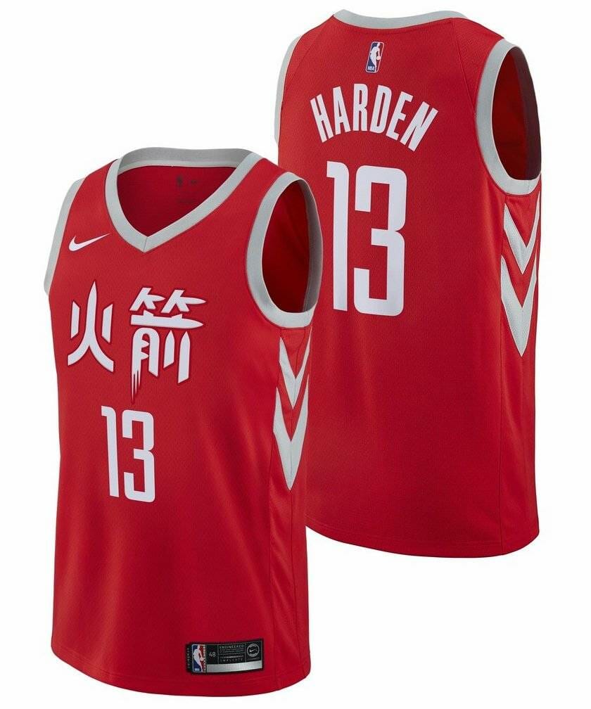
Maybe somebody forgot to tell the Rockets they could actually change their jerseys. The Chinese lettering as a nod to their fanbase across the Pacific Ocean is a nice touch, but it's something they've done a lot in years past. They could have done so much more than a rehash of an old idea.

29. Dallas Mavericks

IMAGE BY: Nike.com
[dx_custom_adunit desktop_id="RTK_K67O" mobile_id="RTK_5yk0"] I'd give the Mavericks points for effort, but I'm not sure they put much into these. I'd expect better from a team that once hired Diddy to design an alternate jersey. The neon glow supposedly represents the Dallas skyline that no one outside of Dallas is aware of. Come on, Cubes.

28. Detroit Pistons

These are supposedly inspired by Detroit's automotive industry, with "chrome" lettering. All I see is a practice jersey. Thankfully they had the sense to scrawl the city's nickname across the front to give it at least some personality, even if just the tiniest amount. Sorry, boring.

27. Phoenix Suns

IMAGE BY: Nike.com
Remember what I said about the Pistons' City Edition looking like a practice jersey? Ditto here. At least this one is a more eye-catching purple than plain navy blue. "Los Suns" is a nice nod to the community's deep Hispanic heritage. Still, there's not much going on here.

26. Atlanta Hawks

IMAGE BY: Nike.com
[dx_custom_adunit desktop_id="RTK_K67O" mobile_id="RTK_5yk0"] The interesting colors in this nod to the Hawks' jerseys from the '70s would be cool if they hadn't been doing that already in recent years. Nothing about this screams "Atlanta!" to me. The lettering, according to Nike, takes "inspiration from the city's cutting-edge music scene." Sure it does.

25. Washington Wizards

IMAGE BY: Nike.com
Sooo ... basically the exact same jerseys but with "The District of Columbia" written on the front? The side panels are supposedly shaped like the Washington Monument, but isn't just about every side panel shaped like the Washington Monument?

24. San Antonio Spurs

IMAGE BY: Nike.com
You knew at least one team was going camo. San Antonio is home to some of the oldest U.S. Army installations in the country, but good luck finding someone not from the city who knows that without looking it up. Remember the Alamo, forget these digi-camo jerseys.

23. Denver Nuggets

IMAGE BY: Nike.com
[dx_custom_adunit desktop_id="RTK_K67O" mobile_id="RTK_5yk0"] These would be pretty cool if they weren't so damn familiar. Great logo and great color scheme, but it would have been great to see something different from a team that already has some of the sickest standard jerseys in the league.

22. Brooklyn Nets

IMAGE BY: Nike.com
There are some great elements to this one. The side panels are designed to resemble the arches in the Brooklyn Bridge, and the black pattern features the bridge's cables. But it just looks too similar to the Nets' usual jerseys. My suggestion: replacing the black with the rusty brown of the bridge.

21. Sacramento Kings

IMAGE BY: Nike.com
Just another rehash of a franchise's former jerseys. This time, the 1985 Kings. Cool logo and color scheme and all, but this has nothing to do with the city of Sacramento. Might as well take the usual Kings jersey and just write "We have been playing basketball here for several years" on it.

20. Memphis Grizzlies

IMAGE BY: Nike.com
[dx_custom_adunit desktop_id="RTK_K67O" mobile_id="RTK_5yk0"] Simple, sure. But bold? Totally. And it has great history: "inspired by the 1968 Memphis Sanitation Workers Strike 'I Am A Man' slogans and replacets on the events, circumstance, and losses surrounding the movement, including the 50th Anniversary of the assassination of Dr. Martin Luther King Jr."

19. New Orleans Pelicans

IMAGE BY: Nike.com
Yes, I'm sure no one saw the Mardi Gras theme coming, Pelicans, you've outsmarted everyone once again. Even the numbers are designed to look like drunk tourists falling down flights of stairs set to jazz music.

18. Cleveland Cavaliers

IMAGE BY: Nike.com
In a vacuum, these aren't all too exciting. But I'm into how great of a departure they are from previous Cavaliers jerseys. The side panels represent the "Guardians of Transportation" statues that stand guard over the city's Hope Memorial Bridge.

17. Chicago Bulls

IMAGE BY: Nike.com
[dx_custom_adunit desktop_id="RTK_K67O" mobile_id="RTK_5yk0"] These are great! Love the script lettering and the color scheme. There's just one painfully glaring issue: It's essentially just a recent Los Angeles Clippers jersey, with "Chicago" emblazoned on the front instead.

16. Oklahoma City Thunder

IMAGE BY: Nike.com
Somehow, the blue and orange stripes are meant to represent "the coming of a storm and the forces of nature." I'm not sure I see that, but that fading gray as a base is pretty damn sweet.

15. Toronto Raptors

IMAGE BY: NBA Europe
In case you weren't aware, Toronto is in Canada, which is north of the United States. Get it? And in case you don't know, they even included an arrow to remind you where north is. Props for the colorway, though—gold and black is an underutilized theme in sports uniforms.

14. Philadelphia 76ers

IMAGE BY: Nike.com
[dx_custom_adunit desktop_id="RTK_K67O" mobile_id="RTK_5yk0"] These are sick, with the script and colorway representing the signatures on the parchment paper that is the Declaration of Independence. Just one issue: That makes them look a hell of a lot like last season's Christmas jerseys.

13. Golden State Warriors

IMAGE BY: Nike.com
Damn you, Warriors. The best team in the world and some fire City Edition jerseys? I'm into the slight deviation from their typical color scheme, and several nods to the Bay Area's considerable Chinese culture. Who knows how high this one would be with a neck opening I could bear to look at.

12. Los Angeles Clippers

IMAGE BY: Nike.com
This is supposedly a tribute to the Clippers' jerseys from their days in San Diego. But we know the truth: Owner Steve Ballmer is a huge fan of the cinematic classic "Semi-Pro" and loves to get tropical. The Clippers are going to the Flint, Michigan, Mega Bowl!

11. Boston Celtics

IMAGE BY: Nike.com
[dx_custom_adunit desktop_id="RTK_K67O" mobile_id="RTK_5yk0"] A closer look takes these from lame to ooh la la. At first, it appears to be the same old iconic Celtics jersey, but on top of a gray base. But further inspection reveals the gray is in a parket pattern, an ode to the famed hardwood floor at the Boston Garden.

10. Indiana Pacers

IMAGE BY: Nike.com
Great nods to the automotive racing world that Indiana is so associated with: The yellow stripe includes a checkered pattern, like that of a racing flag, and the circled number is an ode to how numbers were once painted onto racing cars. Gotta love the vertical team name, as well.

9. Los Angeles Lakers

IMAGE BY: Nike.com
We've teased this one before. It's all about Kobe Bryant: a "black mamba" design, complete with a deep black as well as a scaly pattern, complete with the team's old three-dimensional lettering.

8. Minnesota Timberwolves

IMAGE BY: Nike.com
[dx_custom_adunit desktop_id="RTK_K67O" mobile_id="RTK_5yk0"] This is how you do a gray jersey. The colors are supposed to represent both the fur of a wolf and the barren white expanse of the state in which the team resides. If you've never been to Minnesota, this is exactly what it looks like. There's not a lot going on here, but it's clean and different.

7. Milwaukee Bucks

IMAGE BY: Nike.com
Not only does the cream perfectly accentuate the other colors on the jersey, it has significance: Milwaukee is known as Cream City because of the bricks produced from clay found in and around the city. I'm not sure where that blue comes from, but I dig it.

6. Utah Jazz

IMAGE BY: Nike.com
Love this bold change from Utah's standard jerseys. There's very little jazz to speak of in the state of Utah. But there is a heck of a lot of orange, yellow, and red—the color scheme is meant to depict the state's deserts and red rock formations.

5. New York Knicks

IMAGE BY: Nike.com
[dx_custom_adunit desktop_id="RTK_K67O" mobile_id="RTK_5yk0"] These aren't so much fire as they are firefighter—honoring the New York City Fire Department by repurposing the logo of New York's Bravest. Instead of vertical side panels, it has two horizontal ones that look like the reflective tape of a firefighter's gear.

4. Orlando Magic

IMAGE BY: Nike.com
I have zero clue what the Orlando Magic have to do with space, but I don't care. These jerseys have generally taken heat from the NBA fandom community, but props for going big with something no one else would dare try.

3. Charlotte Hornets

IMAGE BY: Nike.com
Oh man, these are sharp. I mean, literally, the logo features two stingers on opposite ends of the slick "Buzz City" handle. They're docked points for featuring zero tributes to the actual city of Charlotte, but come on, look at that teal-and-purple hive pattern on the side panels.

2. Portland Trail Blazers

IMAGE BY: Nike.com
[dx_custom_adunit desktop_id="RTK_K67O" mobile_id="RTK_5yk0"] Much like Darth Helmet and Colonel Sanders in the comedy classic "Spaceballs," they've gone plaid! And for good reason, too: The pattern is a nod to the splashy wardrobe of former head coach Dr. Jack Ramsay, who led the team to the 1977 title. Also, you can't go wrong with a name like Rip City.

1. Miami Heat

IMAGE BY: Nike.com
Miami Heat owner Micky Arison has been teasing a "Miami Vice"-themed uniform for years now, and it's finally arrived. This bad boy would look pretty slick under a white blazer with the sleeves rolled up while you make drug busts and dramatically take off your sunglasses.