Have you gone to the movies and asked, “Why are all these posters orange and blue? And also, am I bothering anyone by asking this out loud?” We can’t speak to that last part. But we can help explain the phenomenon of orange-and-blue movie posters…
The Bourne Identity
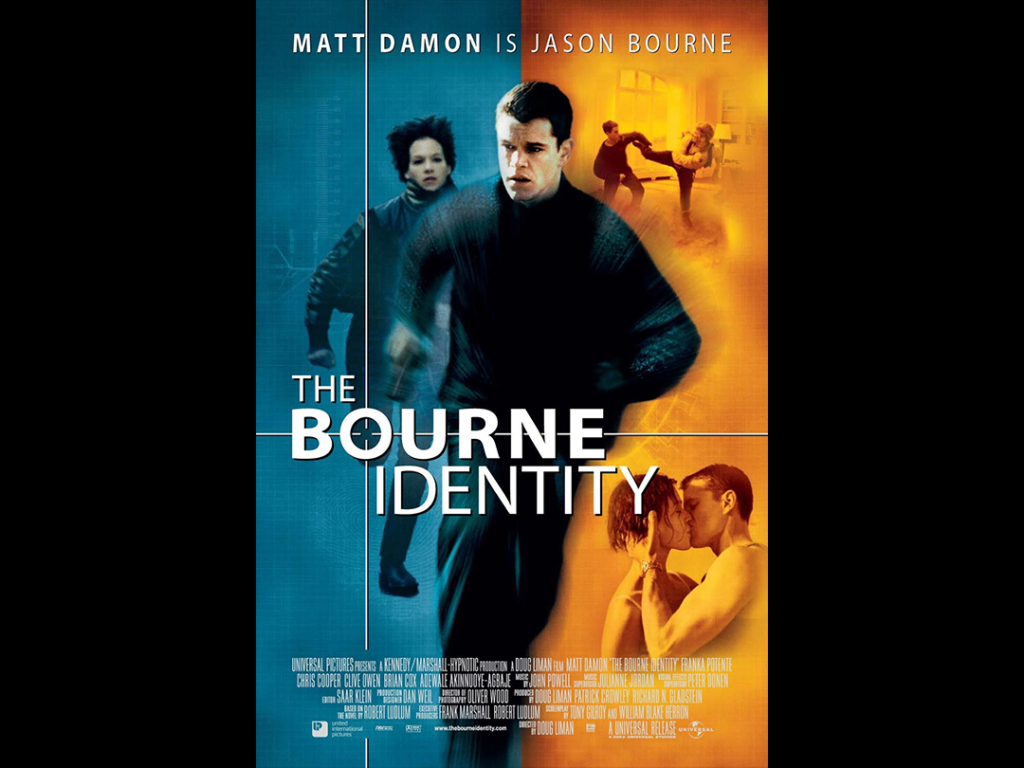
First, a bit of color theory 101 for this movie title. Flesh tones in cinema often fall into an orange range of colors. And if you look at a standard color wheel, you’ll notice a blue range of colors lies on the opposite end. In color theory, these types of opposing colors are called “complementary.”